This is a series I did my freshman year of college for ![]() Life In Color (INQR-1562).
Life In Color (INQR-1562).
The assignment, over the course of the semester, was to create six pieces that used color to communicate a theme related to a given word. We were given six words (quiet, exquisite, dynamic, stoic, fragile, and healthy) and six color palette types (analogous, split complementary, tertiary triad, tints, monochromatic, and complementary). I believe the assignment schedule was based on color palette type, and we got to pick the exact colors we wanted to use and which word to pair it with.
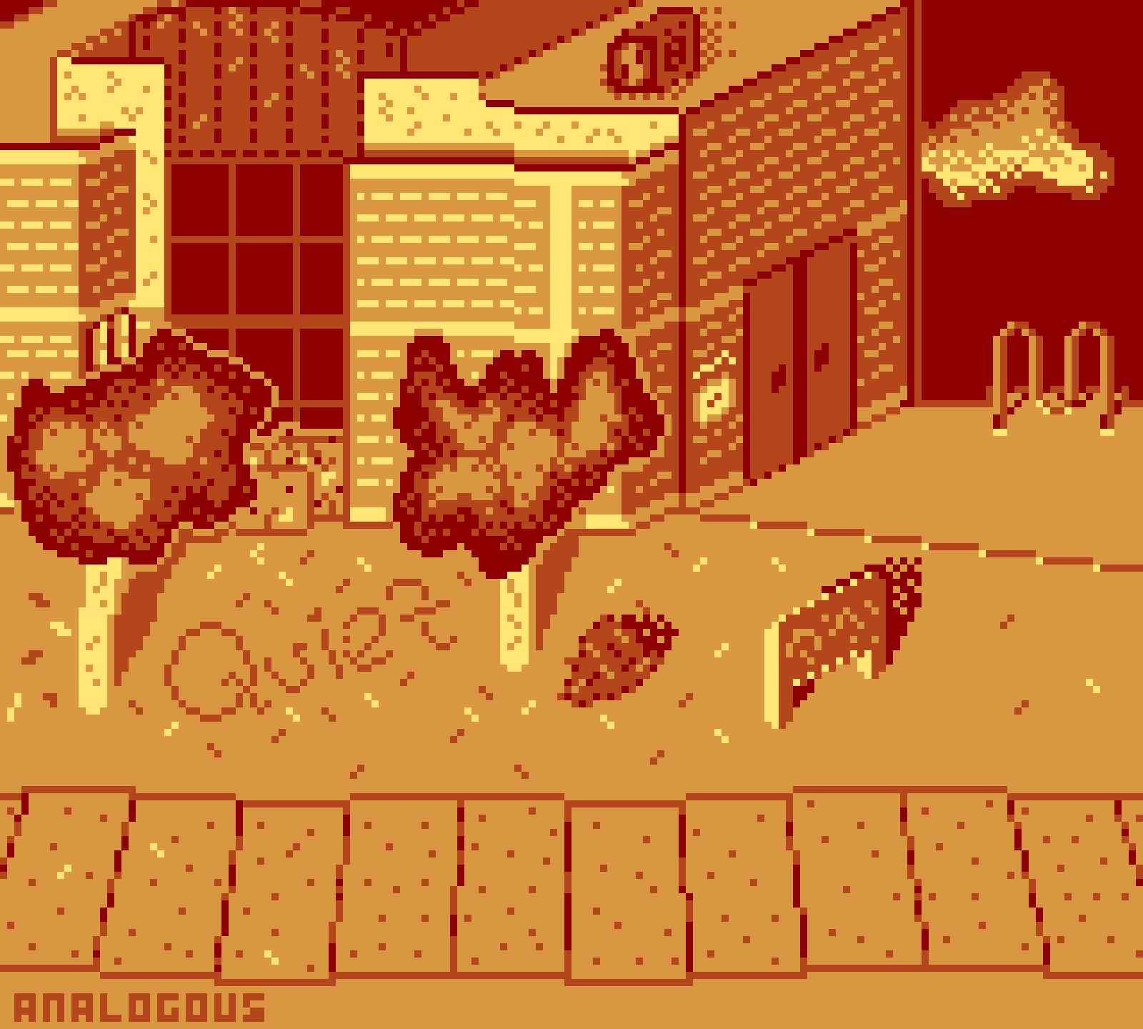
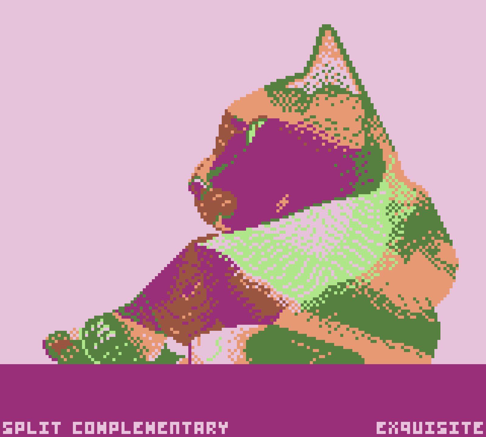
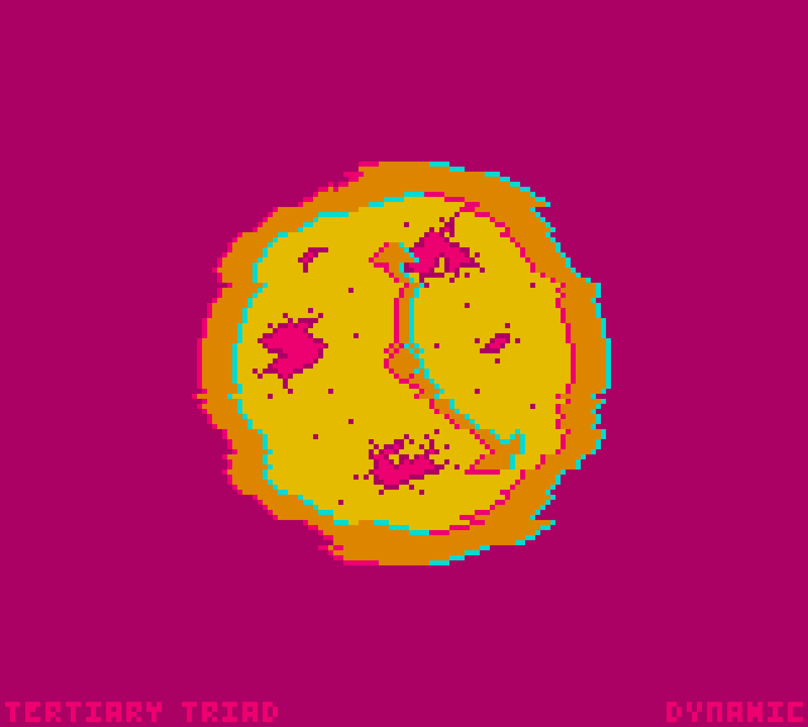

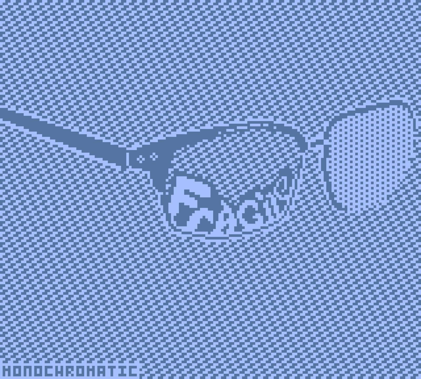
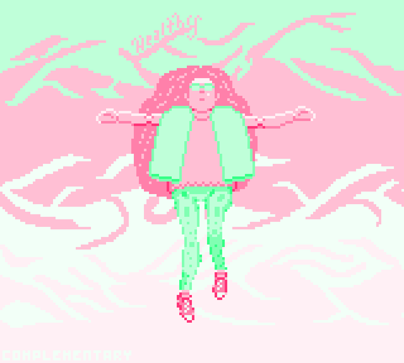
This was some of my earlier pixel art work. The pieces have the same resolution as the gameboy and I initially set out to stick to 4 colors, but that quickly became infeasible for me. I also initially wanted to animate each piece, but this caused me to fall behind so I only animated two of them.
All of the pieces reflect some part of how I was feeling during that first semester. Kinda in pairs too, though that wasn't planned. Quiet was based on fond memories from high school of biking in the crisp fall air and hanging out with friends at the library after school. Exquisite was based on my wonderful cat Padme, who I was missing a lot. Dynamic and Stoic go together-ish, reflecting struggles with anxiety, adhd, and feeling stuck in time or rushed by it. Fragile was about insecurities and dysphoria while Healthy was about feeling free and hopeful for the future.